Marcel
de Groot
CEO

You might not give it much thought, but the use of colour in an office space has a direct influence on your mood and productivity. So why would you ignore the effect of using colour in an office space? Especially when you consider that a dull office can have a significant negative effect on both employee mood and productivity. But which colour has which effect?
The tricky part is of course which colours to go for and how to make a good choice. Google, for example, regularly changes the colour scheme of the office space in every department. With the help of these tests and questionnaires they research the influence of a colour and what effect it has on the mood of employees.
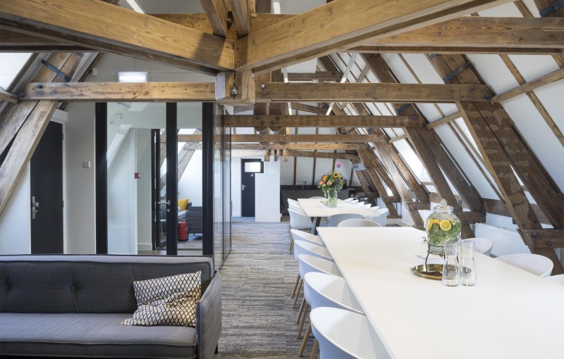
There is no fixed or perfect colour to use. This is different for every company, department and person. However, there are a number of basic principles that generally apply. It is especially important that there is a certain synergy between the different rooms. Think for example of certain colour accents or paintings with the same style.
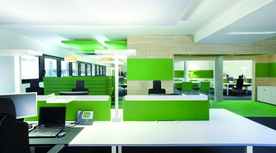
Research by the University of British Columbia indicates that the colour blue enhances creativity, while the colour red can lead to an increase in concentration. So for meeting rooms or brainstorming sessions, it is best to place people in a blue room to stimulate creative ideas. So take a good look at the colours of the walls for your new office. Nowadays, landlords are increasingly taking such wishes into account and offering offices that already have this feature. For instance, offices in Rotterdam or smaller places like Schiedam.
The reception/entrance area is the first point of contact with the office. Both employees and clients should feel positively welcomed here. For this a soft orange or yellow colour is ideal.
In the office itself it is important to consider the desired effect. Blue and green create a calm atmosphere, but if you use too many of these colours, productivity will decline. A few red, orange and/or yellow accents increase energy and thus productivity. But beware, too much red can cause aggression, too much orange facilitates social interaction and too much yellow can increase stress and nervousness. .
Turquoise (ocean blue) is a positive colour for coaching and presentation spaces. This colour stands for creativity and communication. Moreover, turquoise has a calming effect on speakers. This combined with a few yellow accents on handouts and in the presentation ensure an attentive audience that can absorb more information,
Do not opt for too strong bright colours.
Avoid white as it reflects light and makes your eyes tired.
Too much grey is boring.
Avoid dark colours, they make you feel sombre and sleepy.
Stripes or geometric patterns do not work well for offices because they are distracting.
The colours in your office also influence your customers and their first impression. Below is an overview of some of the colours and their associated associative characteristics.
Blue - Loyalty, trust, wisdom, conservative, stable and secure.
Green - Security, growth, wealth and prestige.
Purple - Generous, mysterious, powerful and loving.
Yellow - Cheerful, thoughtful and energetic.
Orange - Warm, happy, creative, successful, stimulating and refreshing.
Red - Energetic, loud, passionate, strong, expressive and intense.